
I spent a couple of weeks at the park creating a JOURNAL cover for Lilla Rogers GTS.
Theme? Retro playground. I didn't do much research (something you are supposed to do). I found these images at my parent's house when I was almost finished. That's me.

Love the fringe on my brother's stroller.

With my little sister.

Without those images, I just did what was in my brain. I started by drawing really tiny stuff to change line quality.

My first concept was good day/bad day. Show cute stuff in the park and bad stuff like the kid getting stung by a bee. The interior journal pages would ask you about your day (wonder where I got that idea Judy?).

Then I had an idea to focus on each letter.


The reverses were done with pathfinder in Illustrator.
I started playing with color, arrangement and repetition.

I like to overlay stripes and select MULTIPLY. Fab effect I use in graphic work.
Yes, those stripes are from my 2009 vita.mn ad campaign. Lilla said not to use anything old.

New direction. Dark background piece was a turning point. "I like how your eye can just focus on each item." said my co-worker. I liked the do-dads.

I wanted to fit more icons on there. The concept was missing something. It's a JOURNAL.
How about adding a pen and some ink? I remember Mom saying Sheaffer was THE brand to have back in the day.

I needed to fix the Sheaffer typo. I swapped out the ink bottle and added unique do-dads.


Throughout the project I could hear Lilla's advice: Icons are king. Have lots of them. Layers of discovery. Original typography. Quirky characters. Interesting palette. Big/little. Does it pop? Does it work tiny on the internet? Have a memorable presentation.

Finis. I feel a little bad that there isn't a dog in there. I had swapped out the bandshell that had a dog.


And Little Orphan Annie remains an orphan (I just saw the play on Broadway). She didn't make the final cut, either. Just noticed she's bald and the hat is not right. And her left sleeve is missing and the type is not so great...

UPDATE AUG. 2: Nope didn't make the final cut. Turns out 1500 other artist submitted entries.
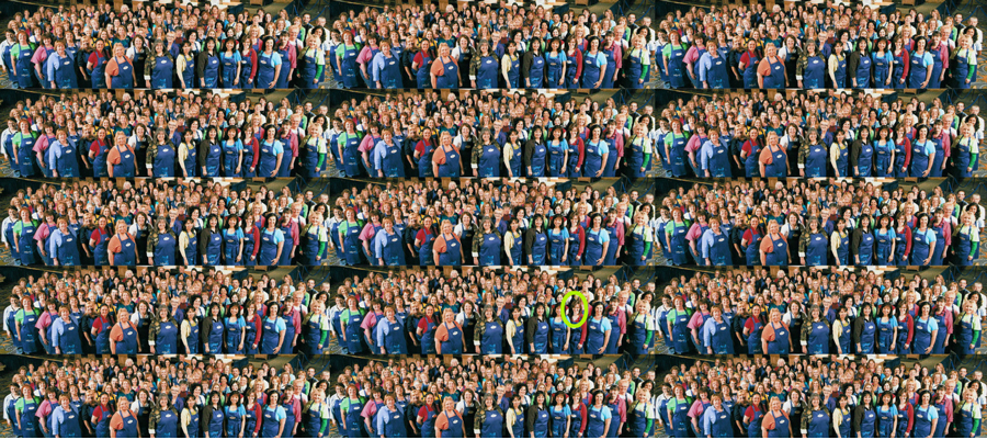
Here's what 1500 people looks like.
All interesting! Back stories are important. You got SKILLS!
ReplyDelete