Showing posts with label MATS. Show all posts

Monday, December 1, 2014

Pillsbury Grands! Ole Opry or Country Music (Carla) Hall of Fame?

After I found out I was one of the 100 finalists in the 47th Pillsbury Bake-Off® contest, I got to work. Not practicing making my recipe for the competition, but creating art. I started with a technique I learned in Lilla Rogers online classes. First you do a little research and get warmed up drawing all things related to your topic. First NASHVILLE:

Then Pillsbury. I watched YouTube videos of the contest. 

What would the doughboy do in Nashville? 
Get a new country suit fitted by Manuel

Sing at the Ryman? At the contest party, I fed the band these song titles and they had a little fun with them.


My first draft was inspired by Minnie Pearl + Macy's Thanksgiving parade + Nashville.
My friends thought the balloon should be more doughboy-like. Respectful of trademarks and licensed characters, I decided the balloon would be me and my Pretzel Bites with my handlers. That made sense for a team shirt.
On the plane ride home I got another idea I wanted to explore. Top Chef finalist and The CHEW anchor Carla Hall was this year's host of the Bake-Off®. She added so much fun and excitement to the contest. Turns out, she's from Nashville so I began my artwork swap.
My plan was to make a normal thank you note. After hearing Carla and THE CHEW co-hosts discussing special greeting cards and creating a pop-up card on the show I got a BIG idea.


A thousand thanks to TEAM PILLSBURY and CARLA for a Bake-Off® well done!


Sunday, November 3, 2013

Feelin' Maple Groovy

When you get out on foot in your own backyard, there are many things to discover. Who knew we had this cool bandshell overlooking a pond?


Complete with trendy patterns.
Complete with Minnesota made LOLL furniture.
Our library is home to several public art installations.
Watch out for dragons!
We have giant power lines running through the city that are now my best friends.

Maple Grove was settled by Pierre Bottineau in the 1850s.

He had a cute house that is preserved at the park:
We also have a lot of BORING houses here.
No, I don't live in the cute house below, but i know who does.
Maple Grove is also home to gravel pits, a giant windmill that powers the entire town (jk!) and Jessie Ventura (he moved away). It's also home to every chain restaurant on earth. Armed with that info and 75 hours of vacation time, here is the result:

Monday, July 22, 2013

Lilla Roger's Global Talent Search

I spent a couple of weeks at the park creating a JOURNAL cover for Lilla Rogers GTS


Theme? Retro playground. I didn't do much research (something you are supposed to do). I found these images at my parent's house when I was almost finished. That's me.
Love the fringe on my brother's stroller.
With my little sister.
Without those images, I just did what was in my brain.  I started by drawing really tiny stuff to change line quality. 
My first concept was good day/bad day. Show cute stuff in the park and bad stuff like the kid getting stung by a bee. The interior journal pages would ask you about your day (wonder where I got that idea Judy?).
Then I had an idea to focus on each letter.

The reverses were done with pathfinder in Illustrator.

I started playing with color, arrangement and repetition. 
 I like to overlay stripes and select MULTIPLY. Fab effect I use in graphic work.
Yes, those stripes are from my 2009 vita.mn ad campaign. Lilla said not to use anything old. 
New direction. Dark background piece was a turning point. "I like how your eye can just focus on each item." said my co-worker. I liked the do-dads. 
I wanted to fit more icons on there. The concept was missing something. It's a JOURNAL.
How about adding a pen and some ink? I remember Mom saying Sheaffer was THE brand to have back in the day. 
I needed to fix the Sheaffer typo. I swapped out the ink bottle and added unique do-dads.

Throughout the project I could hear Lilla's advice: Icons are king. Have lots of them. Layers of discovery. Original typography. Quirky characters. Interesting palette. Big/little. Does it pop? Does it work tiny on the internet? Have a memorable presentation. 
Finis. I feel a little bad that there isn't a dog in there. I had swapped out the bandshell that had a dog.
And Little Orphan Annie remains an orphan (I just saw the play on Broadway). She didn't make the final cut, either. Just noticed she's bald and the hat is not right. And her left sleeve is missing and the type is not so great...

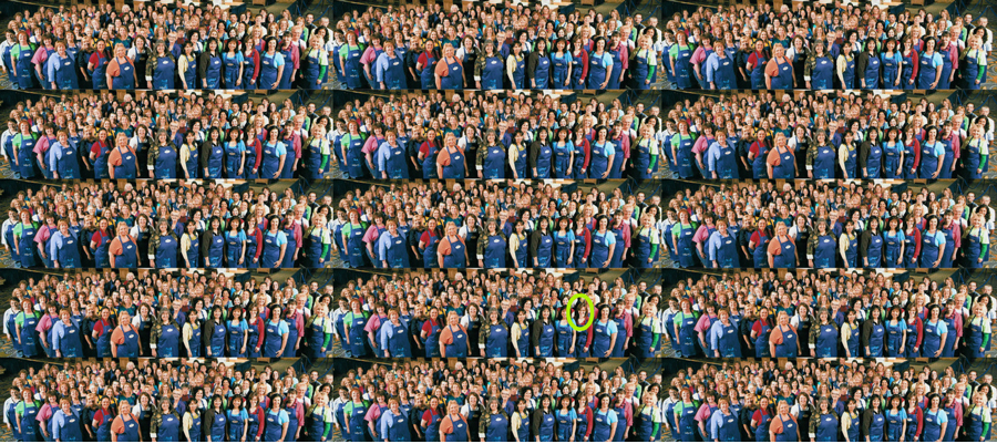
UPDATE AUG. 2: Nope didn't make the final cut. Turns out 1500 other artist submitted entries.
Here's what 1500 people looks like.