Monday, July 22, 2013

Lilla Roger's Global Talent Search

I spent a couple of weeks at the park creating a JOURNAL cover for Lilla Rogers GTS. 


Theme? Retro playground. I didn't do much research (something you are supposed to do). I found these images at my parent's house when I was almost finished. That's me.
Love the fringe on my brother's stroller.
With my little sister.
Without those images, I just did what was in my brain.  I started by drawing really tiny stuff to change line quality. 
My first concept was good day/bad day. Show cute stuff in the park and bad stuff like the kid getting stung by a bee. The interior journal pages would ask you about your day (wonder where I got that idea Judy?).
Then I had an idea to focus on each letter.

The reverses were done with pathfinder in Illustrator.

I started playing with color, arrangement and repetition. 
 I like to overlay stripes and select MULTIPLY. Fab effect I use in graphic work.
Yes, those stripes are from my 2009 vita.mn ad campaign. Lilla said not to use anything old. 
New direction. Dark background piece was a turning point. "I like how your eye can just focus on each item." said my co-worker. I liked the do-dads. 
I wanted to fit more icons on there. The concept was missing something. It's a JOURNAL.
How about adding a pen and some ink? I remember Mom saying Sheaffer was THE brand to have back in the day. 
I needed to fix the Sheaffer typo. I swapped out the ink bottle and added unique do-dads.

Throughout the project I could hear Lilla's advice: Icons are king. Have lots of them. Layers of discovery. Original typography. Quirky characters. Interesting palette. Big/little. Does it pop? Does it work tiny on the internet? Have a memorable presentation. 
Finis. I feel a little bad that there isn't a dog in there. I had swapped out the bandshell that had a dog.
And Little Orphan Annie remains an orphan (I just saw the play on Broadway). She didn't make the final cut, either. Just noticed she's bald and the hat is not right. And her left sleeve is missing and the type is not so great...

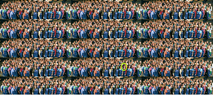
UPDATE AUG. 2: Nope didn't make the final cut. Turns out 1500 other artist submitted entries.
Here's what 1500 people looks like.
Tuesday, July 9, 2013

I MET an Illustrator I just LOVE: Sarah McMenemy

I picked up a charming fold out book on vacation by Sarah McMenemy. 
This is the outer box.
Inside is the foldout.
The foldout is 2-sided.
So wonderful. She has another one on the Met. 
And DC and Paris. I could buy them all!


Sunday, July 7, 2013

Make Art That Sells: Week Five-Over-And-Out

This week we studied the gift market and the assignment was to create art for a pencil pouch. I was just in NYC and saw great stuff there. Found illustration on objects of all kinds at Pylones.
Judy had given me a bucket of pink and yellow items to use in last week's assignment. I was on vacation and missed that class, so I decided to use them this week. Thanks Judy!  
I set up mini collages of objects and photographed them. This is a broken ceramic flower with a really cool cheap plastic bracelet around it:
Just what is that plant on that bottle cap?
I wanted to work in a NYC vintage map.
This is a card my daughter made with a heart maze and plastic toy placed on it. I'm not sure it is politically corrert to use the yellow toy, but my plan is for the Indian to battle the plastic dinosaur.
This is made of 5 items:
My daughter made the leaf in elementary school, piled with more trinkets from Judy.
Then came the Photoshop work. First attempt:
Then I decided to posterize. Think it needs more dice.
Time to sleep on it. I'm not a photoshop artist. How do I get some of me into the piece?

Now let's play with the background color.
Finis.


Monday, June 24, 2013

Make Art That Sells Weak 3: Hans Goes Solo

This week's assignment was illustrating the cover or a spread from Hans Christian Anderson's "The Snail and the Rose Tree." A depressing fairy tale and in today's terms it's much like the B side of single that never made it.

First up snail research. The cute thing I learned about snails is that their eyes are on top of the antennas.

I thought about the Rose Tree. Many of the students in the class made them into sweet cute ladies.
We also drew titles and quotes from the story.

Of course, the snail doesn't want to be lame and just grow roses like the tree, he wants to go to the MOON.
See the number 5? That is my 5th attempt at the composition of the sketch.
This remains unfinished..it needs hours and hours of work. To do list:
1. finish the outer space world. 
2. The snails don't match. 
3. Fix the way beavers really cut down trees, like a pencil point.
4. Add some rose vines to the blast off tree or passenger on the snail. 
5. the lady on the left has dark lines and the moon scene has black lines.

After working on that for a WHOLE day, my daughter said she liked this direction better.
Lilla said to create great environments. 
Without any power from the storm, I used my door as a lightbox.
Yes, the boy is zombie creepy and so is the girl. Without the internet and electricity, I could not go to Pinterest and find out what a ballet shoe, raccoon or Sherlock's hat looked like. 
After stealing some power from the neighbors, I made those corrections and I turned this in:
I also did an all pink version.
Is there Hans Christian Anderson the IVth? My apologies to the Anderson family.